Spatialising Research
Geo-semantic research networks inspriring academic collaborations
CHALLENGE
To use spatial information to identify the ways in which people, places and topics can be meaningfully displayed and analysed.
PROJECT
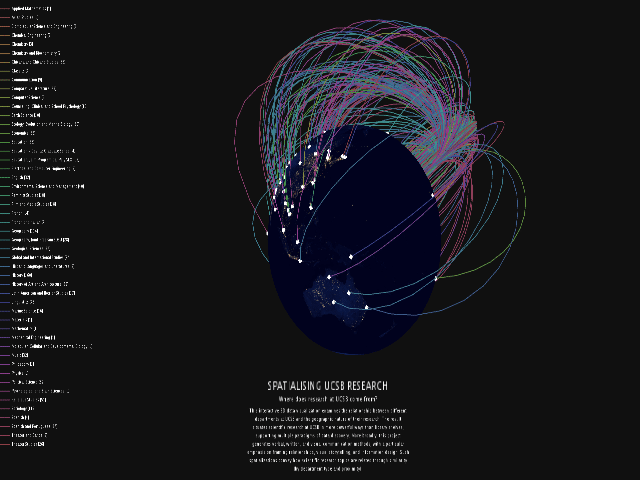
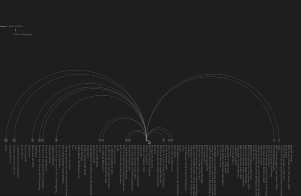
A 3D data "spatialisation" examining the relationship between different departments at UCSB and the geographic nature of their research.
To use spatial information to identify the ways in which people, places and topics can be meaningfully displayed and analysed.
PROJECT
A 3D data "spatialisation" examining the relationship between different departments at UCSB and the geographic nature of their research.
As a researcher, how would you go about finding work similar to your own?
Measures of similarity could include research done in similar regions of the world, research by similar departments and scholars, research with topical correspondence, or research that co-occurred at the same temporality, reflecting contextual change.
Determining these measures of similarity from a digital text collection requires mining document metadata. This project experiments with mapping from non-spatial tabular meta-data to spatialisations.
Process 1: Introduction
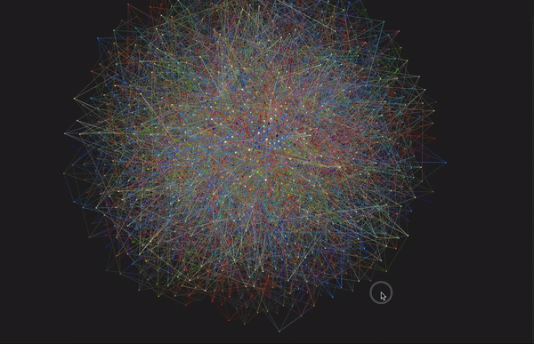
Spatial information provides guidance for the ways in which people, places and topics can be meaningfully displayed and analysed. Spatialization embeds documents into a metaphorical space where documents in closer proximity can be perceived as similar.
Different conceptualizations of similarity, such as geographic and topical, lend themselves to analysis through different spatializations with varying measures of distance. By spatializing information, researchers can compute on collections of research documents, asking questions like “Where in the world is the density of my domain’s research the highest?”, “Which domain is the most spatially diverse? or “What other research shares the same spatial neighborhood as my domain?”
Process 2: Idea
To explore these questions, I wanted to display the geographic reach of departmental research published at UCSB, using a tool that the general public to interrogate Santa Barbara’s connection to other locations across the world. The "spatialisation" was inspired by the metaphor of global networks attributing cultures traditions and histories to different locales, and how researchers travel to investigate these cultural geographies and transfer those resources and knowledge to Santa Barbara. I aimed to represent these flows of information from locations to UCSB within my visualisation.
Process 3: Data Cleaning
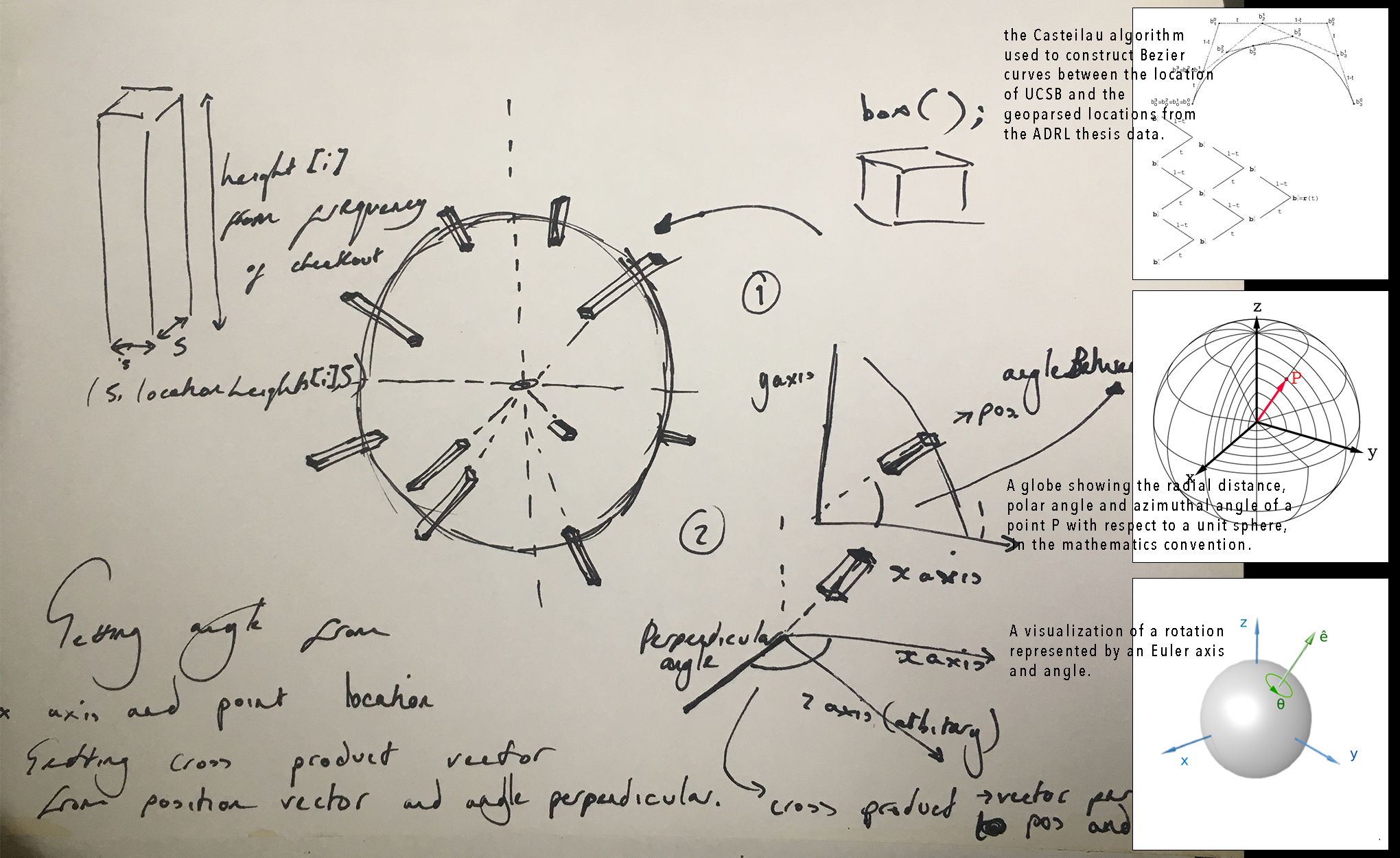
I scraped the ADRL UCSB Electronic Theses and Dissertations (N=1731) for the corresponding fields; Title, Year, Author, Degree Grantor, Supervisor, Description, Language. To identify any locations specific to the thesis or dissertation I pushed the results through a geoparser which compared the word strings to individual place names in Gazeteers.
To geoparse the data I selected gazeteers at multiple levels of geography and parsed the strings through each, to extract place names from multiple place scales. The geoparsed results were read into R and geocoded using code which returns the latitude and longitude of the place name, with Bezier curves connecting locations mentioned within the same theses. Furthermore, interactivity was introduced into the "spatialisation", as hovering over a department in the legend, reveals the location links for that department. When the user has selected the department, the titles of the theses or dissertations associated with the geographic placements are shown.
Process 4: Interactivity
This interactive 3D data “spatialisation” examined the relationship between different departments at UCSB and the geographic nature of their research. The result situates scientific research at UCSB in more powerful ways than library shelves, supporting multiple paradigms of data discovery. More broadly, this project allowed me to generate verbal, written, and visual communication methods, with a particular emphasis on framing relationships, visual storytelling, and information design. Such “spatialisations” convey how scientific research topics are related through similarity (by department type and proximity).
The code to run the visualisation locally is available on Github.
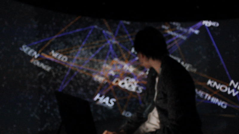
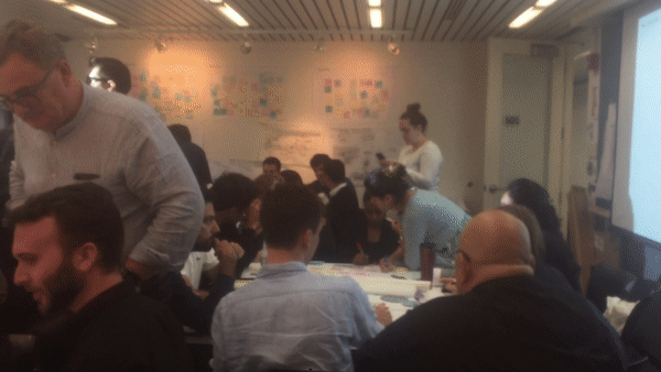
The project was exhibited at the Media Arts and Technology End of Year Show (MAT EYoS) in June 2018.